Thursday, March 31, 2011

I'm Late! I'm Late!

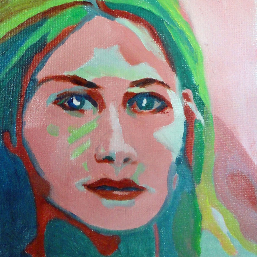
"Sheila, about 3 years old"
Oil on canvas, 4x6",  c. Catherine Vines

It's been a day of torrential rains and power outages, even threats of tornadoes, so I must hurry and post this while I can. This is my beautiful daughter; I don't think her eyes had changed to grey yet. 
I loved using this size canvas boards (4 x 6"), but I can't find them any more for some reason. They were so useful for painting directly from photographs.

Wednesday, March 30, 2011

Have Leftover Skin?

"Walking MacDuff"
Oil on canvas, 6" sq.,  c. Catherine Vines

Skin tones, that is. They make great sand. This handsome young fellow prefers to carry his own leash, or even better, the leash of a fellow dog!
You'll notice I've redesigned by blog after a makeover class with Alyson B. Stanfield.  Please - I would love to hear your reactions.

Tuesday, March 29, 2011

Do You Ever Draw on Canvas w/ Pencil?

"Apple-Cheeked Beauty"
Oil on canvas, 6" sq.,  c. Catherine Vines

Did you know all your pencil marks may still show through? I did - and I still drew with pencil! And they do show. Talk about a slow learner. I am experimenting with paints for different skin colors. This combination is a very straight-forward cad red light, yellow ochre, and white. Initially I tried some viridian for shadows, but finally used some of the same burnt umber as in the hair - which also uses naples yellow and white. The background is the cad red and viridian = grey.

Monday, March 28, 2011

What if You Are a Lousy Painter?

"Out of the Shadows"
Oil on canvas, 6" sq.,  c. Catherine Vines


About 4:00 in the morning - when I still couldn't get to sleep - I had a blinding revelation: I can't paint. Why did I ever think I could? How could I have invested my life in something I'm still no good at?
The next day one of my private students - all of 5 years old - was complaining about his shark: "It just doesn't look right!" I talked to him about practice and patience.  Finally it clicked for me. So I'm not the great painter I secretly yearn to be. I care about improving and I work hard at it. What else matters?
This painting revisits a recent purple/yellow color scheme (see March 19 posting) in the Magnolia Series. A mixture of these two colors makes the loveliest browns, if not the best choice for a portrait. See. I learned something.

Saturday, March 26, 2011

What Comes First?

"Orange Magnolia"
Acrylic on Masonite, 20"x16" c. Catherine Vines


Finally!  I have the answer.  Or Alyson B. Stanfield does: HxWxD. She even has an artist's mnemonic to remember which comes first. Her speciality is "art biz coach" and her advice invaluable. This latest in the Magnolia Series also uses the tar gel I blogged about previously, this time tinted with black. It gives an interesting raised surface to the flower. I even like the irregularity for a more spontaneous look.

Friday, March 25, 2011

Have You Ever Experimented with Tar?

"Yellow Magnolias"
Acrylic on Masonite, 16" x 20," c. Catherine Vines

Tar Gel, that is. The ultramarine blue outlining the magnolia petals is Golden's "Clean Tar Gel," tinted with acrylic paint.  It is a stringy, colorless (without the paint) gel that dries to glossy finish and allows you to drip paint in a more-or-less controlled fashion. Fun, especially if you like to experiment. I think it will accept any color of acrylic paint, but you should check with the manufacturer for specifics. For some reason this magnolia reminds me of a cactus, but that's me. A fun cactus, mind you.


Thursday, March 24, 2011

Tired of Magnolias Yet?

"Pink Magnolias"
Acrylic on Masonite, 16" x 20," c. Catherine Vines

Because there are still more! I think this painting especially shows how I am cropping my photos to select an extreme close-up view. This gives me the abstract look I am going for without removing all references to my flower.  I prefer to paint from black-and-white photos; I find my color choices are more imaginative. By the way, there is no black in this painting.

Wednesday, March 23, 2011

Metallic Paints

"Magnolia Metallica"
Acrylic on Masonite, 16" x 20," c. Catherine Vines

The copper color in this paint is actually metallic paint and in person has a lovely sheen. It's an opaque paint, so it completely covers the colors below, sometimes a disadvantage.  I use a palette knife because I love the way it lets me develop layers of colors.  Working that way can be misleading though if I don't frequently get back from my canvas and look at my painting.  Too many ridges of color can add up to a brown mess because of the way they blend from a distance. I prefer larger areas of overall color complemented with juicy details.

Tuesday, March 22, 2011

What as I Thinking?

"Blue Magnolia"
Acrylic on Masonite, 16" x 20," c. Catherine Vines


I'm sure there's a reason I included so much red in this painting.  It must have seemed a good choice at the time! In person, the blues I used are stronger and balance the reds somewhat better. I am learning that it gives me another perspective on my paintings when I see them posted, not always a pleasant experience. Looking back at my photos of the magnolias makes me think about an all-white painting - now that would be a challenge.


Monday, March 21, 2011

What if Your Painting Wanted to be Bigger?

Magnolia Triptych
Acrylic on Masonite, 34" x 20," c. Catherine Vines

Then you would have to paint a triptych, especially since I have already done the hard work and learned how to spell "triptych." This painting has the clear, bright colors I love. And the palette knife is such a great tool for building broken color patches. Each time I paint a Magnolia in this Series, I can picture something else I want to try, the perfect definition of a series. If there ever was a case of a painting saying it wanted to be bigger, just try and imagine this one with only the center panel. Can you even picture it?

Saturday, March 19, 2011

Purple and Yellow Make....


Acrylic on Masonite, 16" x 20," c. Catherine Vines

A complementary color scheme. This is another in the Magnolia Series, again done with a palette knife. The texture of this painting is a luscious element in its own right.  Claudia, a friend from Seattle, got me started on the palette knife when she talked about her mother using it as a painting tool. It turned out to be a wonderful suggestion. I am currently finishing up a small portrait using the same color scheme but as neutrals.

Friday, March 18, 2011

What's Wrong with Pretty?

Acrylic on Masonite, 16" x 20," c. Catherine Vines

When I look at a pretty painting like this  latest in the Magnolia Series, I wonder what it is that makes me want something different. Two answers come to mind, both weaknesses when it comes to my color choices.  1. I typically use one of two color schemes: analogous (side-by-side on the color wheel) or complementary (opposite on the color wheel).  2. I don't take advantage of neutrals to accentuate my colors. Both of which explain my current emphasis on color relationships. Still, pretty has its place, and this is even better in person.

Thursday, March 17, 2011

In the Beginning

Acrylic on Masonite, 16" x 20," c. Catherine Vines

This is a return to the flower series. Now that you have seen this one, I can admit they are all versions of a magnolia, although perhaps not one you've ever seen. This one - the original - is the only one painted with a brush. If you've never visited the state capitol in WV, where all these flowers were photographed, it's a beautiful, gold-domed structure, visible from the interstate.

Wednesday, March 16, 2011

What if Your Hair Turned Green?

Oil on canvas, 6" sq.,  c. Catherine Vines

Then you might look like this! This portrait resulted from more leftover paint on my palette, plenty of greens from yesterday's work on color relationships. She became a color study in her own right, if of color in the extreme.  Still I think I was able to establish a certain harmony in my choices.  It's a good thing that as artists we are never satisfied.  That's where the next painting comes from.

Tuesday, March 15, 2011

When Composition Falters

Oil on canvas, 8x10" c. Catherine Vines

I can't think how I came to pick this photo to paint, but obviously I didn't follow any 'rule of thirds' or focal point advice.  My intent was to work on color, more specifically, relationships between colors. For a woman who is not fond of the color green, I certainly am painting it a lot lately, perhaps because I have the most to learn about using it successfully.


Monday, March 14, 2011

Working from Photographs

Acrylic on Masonite, 16" x 20," c. Catherine Vines

From my flower series, done with a palette knife. This entire series was based on a group of photos I took at the capitol in Charleston, WV, waiting to catch a plane.  The flowers are actually magnolias, though only the first in the series (not yet posted) looks relatively true. This always seems to be the case.  I start mostly realistic, and as the series grows, become more and more abstract until even I am surprised.

Saturday, March 12, 2011

Never on Sunday

Acrylic on Masonite, 16" x 20," c. Catherine Vines

Today's painting is another from the flower series in acrylics. This too was painted using the palette knife.
On the blogging front, I have decided to take a break from postings just on Sundays.  After all, I will still be painting! I am one of those people who never wrote in a diary beyond January 3rd, but I have found I enjoy blogging - probably because it's about my favorite subject: painting. On the painting front, I have narrowed my next painting to 3 possibilities so I am making progress. Sometimes I have to actually start a painting to realize that's not what I want to do right now. Fortunately, these false starts make good backgrounds for something else.

Friday, March 11, 2011

Art in the Movies


Acrylic on masonite, 16x20"  c. Catherine Vines

How cool. A producer from Universal is coming to the house to look at my paintings (he's already seen some pics) for a show he's working on. It will just be background stuff, but I can still claim bragging rights!
This is among the ones I sent him. The flower is from a series I painted using the palette knife. The colors are even prettier in person. I will post more from this series as I work - in my own slow way - on a new painting.

Thursday, March 10, 2011

Using Leftover Palette Colors

Oil on canvas, 6" sq.,  c. Catherine Vines

I don't really like to finish a painting, even though that's what I work for.  The "what next" dilemma haunts me, and it sometimes takes me days, or even longer to decide where to go.  In this case, my last painting was such an undertaking that I wasn't ready for another tree! Luckily I read an interview of Catherine Kehoe in which she said she used the paints leftover at the end of the day to make a self-portrait.  While this is an amazing neighbor rather than a self-portrait, the idea stands.

Wednesday, March 9, 2011

Abstract Tree #7

Oil on canvas, 48" sq.,  c. Catherine Vines

It's done.  Over the next couple of weeks (or more!) I will make adjustments, but . . . it's done. Yea! and Boo! The "boo" is also because it's done.

Tuesday, March 8, 2011

Paint Relationships

Oil on canvas, detail, 48" sq.,  c. Catherine Vines

I started this current group of photographs based on the idea of light, capturing those clear luminous patches of light within the landscape. The series "Trees as Sculpture" was created with the intent of trying to portray that light.  But then, as always, I fell in love with color and my focus switched to using color schemes to paint from. With this latest tree - nearly finished, yea! - I have concentrated on developing relationships between colors, working my way up and down the value scale. As Ken Kewley says, "The life of a painter is a life of exploring."

Monday, March 7, 2011

Painting Brushes

Acrylic on Masonite, Detail, 15" x 34," c. Catherine Vines

In looking through some emails last night I came across a survey from Marion Boddy-Evans on artists' favorite tools.  So far the front-runner brush was W&N Series 7, which immediately made me want to run out and get one! In fact, I still have some brushes from college.  Taking good care of my brushes has always been a priority. When I am working on a painting, I will fall in love with a brush and think,
This is what I am going to use from now on."  Then with the next painting I start the process all over again.  I believe in the back of my head was this myth that the "perfect" brush would make me a better painter! Now I mainly use the cheap Chinese brushes, and regularly paint over hairs. No magic. Just painting, painting, painting.

Sunday, March 6, 2011

Painting from Photographs

Photograph, 2011,  c. Catherine Vines

My tree series is called, "The Tree as Sculpture." In the beginning as I walked my dog, I would photograph trees just because I liked them.  After I better identified what it was that drew me to the trees, I began to be more selective. Since I am primarily a value-driven painter, I started out by trying to reproduce the values - if not the colors - I had captured.  And I worked primarily from photographs.  But at some point, I have to put the photographs away and paint in response to the painting. Like many others, I believe the photograph is only an aid, and only useful to a certain point. Then the painter must take charge.

Saturday, March 5, 2011

Painting Local Color

Oil on canvas, 6" sq.,  c. Catherine Vines


I realize the term 'local color" can have many meanings; but in this case, I am referring to where I live.  Literally.  These ibises were foraging for food (do birds forage?) in my front yard. More that the birds themselves, I love the shadows across the lawn.  In fact, many of my neighborhood photos have to do with catching the light. I love the interplay of dark and light, warm and cool. This painting is done with a palette knife.

Friday, March 4, 2011

What Makes a Series

Oil on canvas,  8x10,"  c. Catherine Vines

My neighbor got me started painting trees. Joan is on the Tree Board of our town and she asked me to donate a painting for their silent auction.  Since the subject was trees I thought I should try one, even though I am not a landscape painter. This is one of my early paintings for the festival (our "Treebute"). It took several attempts for me to identify what it was that attracted me to the trees. Even back when I was just visiting the town, I had always loved the sculptural quality of its trees.  Once I honed in on that quality, I was able to branch out (so to speak!) into my current series. What interests me the most is learning that I don't have to start out loving something for it to grow into a meaningful and rich series.

Thursday, March 3, 2011

A Complimentary Color Scheme


Oil on canvas, 36" sq.,  c. Catherine Vines

I love this complimentary color scheme of red and green, and have used it innumerable times.  Even more that the color scheme, I love the range of greys.  Using greys has become a new goal for me. For the darks, I mixed complements of the main colors in a variety of values. Now I'm thinking I should have written down the different color combinations I used.  Since then I have started keeping Color Notes.  My oils dry out so fast here that I am constantly remixing so it's a necessity when working on a big painting like this one.  In general I love to mix, and tweak colors; but I can't trust my memory when the combination is a complex one.

Wednesday, March 2, 2011

Painting the Background


Oil on canvas, 36" sq.,  c. Catherine Vines


I find backgrounds challenging.  Somewhere I've read to just paint a lot of backgrounds - in other words, practice, practice, practice. In that practicing, I've tried using the complement of the subject matter.  Mimicking the outside shape of the subject in neutral, darker colors. Painting a deeper version of the subject. Sometimes I've used smooth backgrounds (like today) to contrast the rougher interior strokes. Or the opposite: rough against smooth. But to be well done, I believe the painting has to look as if no other background good possibly work as well. So I keep practicing.

Tuesday, March 1, 2011

Painting a Sunset

Oil on canvas, 36" sq.,  c. Catherine Vines

The most beautiful sunset I've ever seen was off the coast of Edmonds, WA (just to the north of Seattle), looking out over the Puget Sound.  Like most such experiences, it was fleeting and for me, impossible to specifically recall. Still, it stays with me, like a melody I can't quite grasp, yet warming me with its glow. More recently I have been reading Loriann Signori as she writes about painting from memory rather than direct observation or a photo. As proof of her point, she is painting the most beautiful pastels.
This, the second tree in my series, is an even more indirect capture in oil of my experience.